Hello. For some sad reason I decided to write a UX improvement for Articulate, as I am doing a lot of images in a Rise course and it’s highly inefficient and tedious. Sometimes I just can’t help trying to make the world a little better (I think).
I logged in and wrote my post, but it wouldn’t post. So I’m posting it on my blog. And since it’s my blog, I can add some smarm – see if you can spot it. You, who isn’t reading this, I am talking to myself. The absolute state of the internet.
I am building a Rise course and I have noticed it takes 10 clicks to add a picture to a Rise course. It is a unnecessarily large amount of clicks. I feel these days I should just be able to drag it on and Rise’ll figure it out as a centered image by default, but sans that, perhaps you can save us a few clicks.
Current process:
- Click ‘+’ block
- Select image
- select type of image
- click on the added image to get the block bar to go away
- Click on the image ‘pencil’ to configure it
- Click ‘replace’
- Click ‘upload’
- Drag your image
- Click ‘retain quality’
- Click ‘insert image’
- Click back on the course to get the panel to go away.
May I propose a user experience improvement:
- Click + to add block
- ‘image’ and ‘text’ appear either side of the +. (I presume that’s what most people want to add the most often)
(this opens up the side-panel with the image selection panel to pick the type) - Pick type of image.
Rise does steps 4,5 and 6 automatically.
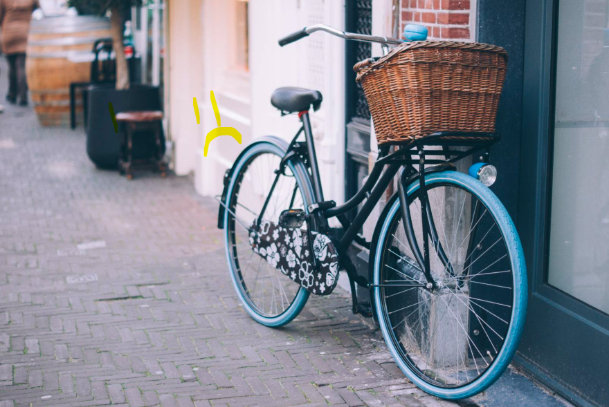
Rise automatically collapses the side-panel, and opens the ‘pencil’ edit, with ‘replace’ menu already open. This is under the assumption nobody has ever published a module with that bicycle, they want their own image. - Rest of it is the same: Click ‘upload’
- Drag your image
- Click ‘retain quality’
- Click ‘insert image’
Rise automatically collapses the side panel after the image is inserted, removing step 11.
What do you think?
I have no expectation of this being done, but sharing this has been cathartic.
Also u suck
Leave a Reply